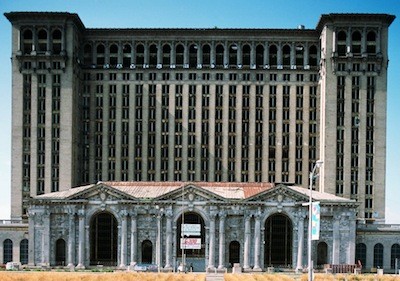
Photo courtesy Camilo José Vergara
"The wood window frames had a wide center divider that visually reinforced the sense of vertical movement ... a seemingly small and subtle detail which nevertheless worked in masterful ensemble to make the entire building soar and impress."
An interesting article appeared yesterday in the Free Press, written by resident architecture critic and historian John Gallagher. Gallagher noted that some are not pleased with the kind of windows the Moroun family is putting up at Michigan Central Station. Gallagher is a respected figure when it comes to Michigan architecture, and he treats the issue with the delicacy of a professional.
So we suppose it’s left to us to say that the train station looks like Moroun and company dialed 1-800-HANSONS.
The piece quotes Moroun employee Ken Carter, who is overseeing the project, as saying he and his colleagues are “very happy with the current windows being installed. We think the building looks great."
Of course, what did anybody expect Carter to say? It’s like asking the emperor’s aide what he thinks of his boss’ new clothes.
We first heard the criticism raised yesterday, before we even saw Gallagher’s piece, via a phone call from intrepid photojournalist and longtime urban photographer Camilo José Vergara. He told us the windows are “totally destroying the subtle vertical emphasis established by the original window frames and sash. What you have now is a big piece of glass and a fake criss-cross placed on the front with no vertical emphasis at all. The details count.”
He says his view was shared by his friend Tim Samuelson, with whom he visited Roosevelt Park last week. Samuelson is the official cultural historian of Chicago, so we thought we’d give him a call. He was happy to discuss the matter with us, but clarified that his views are his alone as a preservationist and historian, and that he wasn’t speaking in his official capacity with the city of Chicago.
Samuelson also understands that gussying up a longtime ruin like Michigan Central Station is “uncharted territory.” And that having windows to keep out the elements is better than leaving them open. But he shares Vergara’s disappointment, and finds the windows lacking.
He tells us, “I can’t vilify the windows, but I don’t like them at all. … I’m surprised that very few people have commented about the major differences between the original window sash and frame design and the replacements now being installed. Perhaps people are so relieved that something is actually being done that issues of design and detail are being set aside. And, as an outsider, I sure don’t want to rain on anyone’s parade.”
And yet, Samuelson offers some good reasons why the original windows, with their thick mullions, contributed to the overall appeal of the building.
He says, “The reason why people feel so passionate about the Michigan Central Station is due to the emotional hot buttons designed into every detail by its original architects. They were masters at triggering human reaction — and in the case of Michigan Central Station’s office tower, it was all about dramatically soaring to the sky in bold, vertical, upward movement. The brick piers between the windows are like soaring vertical shafts that draw the eye upward. But it wasn’t the piers alone that made the building soar: The wood window frames had a wide center divider that visually reinforced the sense of vertical movement. And to take the vertical emphasis even further, the glass of the sash was divided into vertical divisions — a seemingly small and subtle detail which nevertheless worked in masterful ensemble to make the entire building soar and impress.
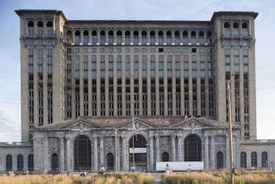
Photo courtesy Camilo José Vergara
"The new windows are simply large pieces of glass superimposed with uniform thin strips in an attempt to suggest the original sash arrangement."
“The new windows are simply large pieces of glass superimposed with uniform thin strips in an attempt to suggest the original sash arrangement. But there’s no wide vertical member at the center to echo the powerful brick piers, and no vertical divisions of the sash to sing verticality in an even finer degree of detail. And where the original window sash had tops and bottoms set at different planes, which reflected light differently, all is now flat and lifeless.
“Ironically, the framing of the new windows is so minimal that the overall opening of glass now appears to have an underlying sense of being horizontal, and actually fights the original vertical power of the tower. This will become increasingly apparent as the windows continue to be installed. The soaring that impressed generations of Detroit residents will be significantly diminished. People may not realize why it seems different, but in their hearts they'll definitely know that it’s different.”
He adds, “It’s a good thing that windows are being installed. The interior structure was not designed to take weathering over an extended period of time, and potentially could have reached the point where the viability of the entire building could have been jeopardized. But what a shame that the original design configuration so critical to the overall design impact was not respected and replicated.”
Chatting with Samuelson, we bring up how New York used to board up vacant buildings with panels that resembled windows. He believes that approach might have been more effective. He says, “You have these openings that need to be buttoned up, and there’s technology now that you can actually make good graphic prints that you can apply to board that look pretty darn good that would cost a fraction of what they’re spending on these windows. … Those windows they’re putting in aren’t cheap. That’s a big piece of glass — and hauling them up there and putting them in is a lot of work. The heartbreaker is: If somebody wants to come in there and re-do the building, you’re gonna wind up taking those out. … I can’t speak for the decisions that were made, but if it were my building and I needed to button it up, I would’ve figured out a boarding solution that would’ve nailed over the existing window frames, that would give an appearance of the actual windows and in some ways help encourage people to say, ‘Hey, look what this would look like.’ To come up with the money to do what needs to be done.”
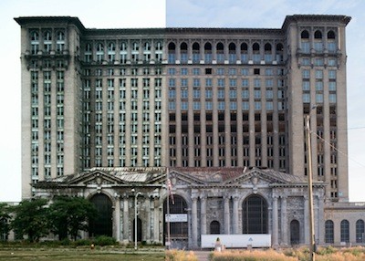
Source images courtesy Camilo José Vergara
A side-by-side comparison affords a look at what happens when "overall design impact" is not respected and replicated.